Fine-Tuning for Sensitivity: Crafting a Melanoma Classifier for the Real World

The word “cancer,” which carries such weight, necessitates the highest attention to detail at every level of my model’s development. A false positive or false negative in a cancer diagnosis has significant consequences. There is no such thing as too much accuracy when lives are at stake.


Early detection of melanoma skin cancer has the potential to save lives. We’ll go over the process of creating a melanoma skin cancer classifier with TensorFlow/Keras and Google Colab in this blog article. We’ll examine the enhancements made to the original model and discuss the reasoning behind each change.

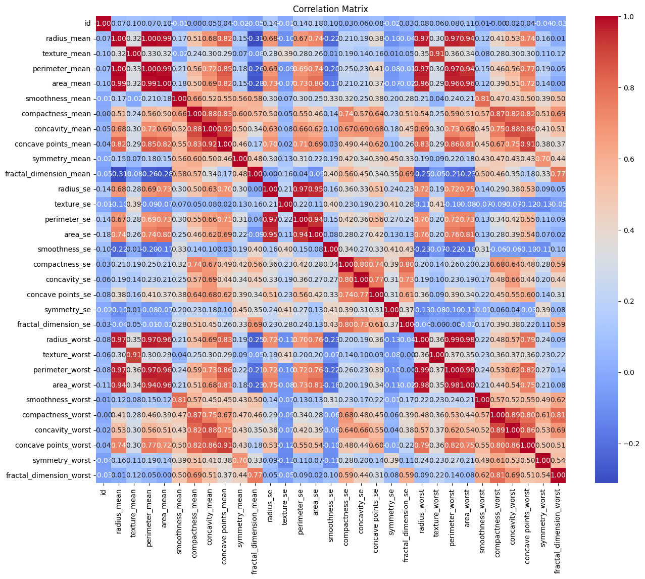
With three convolutional layers, max-pooling layers, and a dense layer for classification, the original model was a simple Convolutional Neural Network (CNN). There was potential for improvement in the model’s performance, as the training log revealed that the model’s performance is not increasing as anticipated and that the validation accuracy appears to be fixed at 50%. The training accuracy in the first epoch is 0.6869, while the training loss is 0.6350. Nevertheless, in the next epochs, the training accuracy falls (e.g., 0.6009 in epoch 2) and the training loss rises (e.g., 0.6642 in epoch 2). In the later epochs, the validation accuracy and loss appear to remain stable, hovering around 0.5000 for accuracy and 0.6939 for loss. With a validation accuracy of 0.5000, the model appeared to be generating predictions at random. Performance during training and validation differed noticeably, which is frequently a sign of overfitting. Rather of effectively generalizing to new data, the model was probably just committed to memory the training set.

Let me explain dropout, L2 regularization, and data augmentation in the context of developing a deep learning model for melanoma classification in plain English before we get started on enhancing this model.

Imagine your neural network as a school full of students, with each student standing in for a neuron. It is the duty of every student to acquire knowledge and make a contribution to the problem’s solution (melanoma classification). But occasionally, students can exhibit excessive confidence and dominance, which can cause them to overemphasize some traits while ignoring others.

Dropout:
In order to avoid this, we present a method known as “dropout.” It’s similar to periodically requesting that some pupils leave the classroom for a break. This indicates that certain neurons, or students, are “dropped out” for a brief time during training (learning). This ensures that all neurons learn to function as a team and that no one neuron becomes overly dominant. Each neuron is encouraged to become more self-sufficient and adaptable by dropout. By preventing an over-reliance on particular features, it strengthens the network and improves its ability to handle different facets of the melanoma classification assignment.

L2 Regularization: Think of a Garden, imagine your neural network as a beautiful garden of flowers. Every flower adds to the garden’s overall performance (beauty) by representing a weight (parameter) in the network. But if some blooms get too big, they could shade out other flowers and throw off the composition as a whole. In order to manage this, we present “L2 regularization.” It’s similar to carefully trimming back the taller flowers so that no single one takes center stage. In this case, L2 regularization modifies the neural network’s weights by a tiny amount. This penalty dissuades any one weight from growing excessively. By ensuring that no characteristic dominates the learning process and that every feature contributes equally to the classification of melanoma, it helps preserve equilibrium. L2 regularization produces a more balanced and well-behaved model by encouraging the neural network to use all features moderately.

Data Augmentation: Consider your dataset as a canvas, with each image being a distinct work of art by an artist that represents various melanoma cases. We employ “data augmentation” to increase the dataset’s diversity and aid the neural network’s ability to identify melanoma in a variety of contexts. It’s similar to taking the original paintings of the artist and altering them by flipping, rotating, or enlarging them. In this instance, data augmentation entails giving the training images a few modest, arbitrary adjustments. One could, for instance, slightly rotate, zoom in, or flip an image horizontally. This guarantees that the neural network observes melanoma from several angles, increasing its adaptability to various real-world situations. Data augmentation exposes the model to a greater variety of circumstances, which improves its ability to generalize. It’s similar to teaching the model to identify melanoma from multiple perspectives in order to improve performance on unseen photos.

In the Dense layers, we will make use of the kernel_regularizer parameter. You can give a regularization function for the layer weights (kernels) using this option. Here’s how you can modify your dense layers to include L2 regularization:

We will use an optimizer with a variable learning rate to change the learning rate as it is being trained. I am utilizing the Adam optimizer, for instance, and the learning_rate option. Usually, the Adam optimizer’s default learning rate is set at 0.001. While this is a fair starting point, there are other elements, such as the model architecture and dataset, that might affect the ideal learning rate. It is a hyperparameter that must be adjusted while building the model.

Since the training loss was not decreasing, I decreased the learning rate. A smaller learning rate (0.0001) helped the model converge more slowly and find a more optimal solution. I also increased the dropout rate to 0.6 which helped regularize the model more effectively, preventing overfitting.

Let’s break down the information: The output shape column displays the output shape for every layer. For instance, the output shape of (None, 222, 222, 32) is a 4D tensor with 222x222x32 dimensions.
The parameter denotes the quantity of weights and biases linked to every layer. For instance, there are 896 parameters in the first Conv2D layer. There were 11,169,218 parameters in the model, all of which could be trained. The size of the layers and the connections between them determine how many parameters are used.

I also want to address another question regarding the learning rate that was posed to me by a coworker. When training a neural network, the learning rate (0.0001) does not directly indicate the end of training or the amount of time needed to train the model. One hyperparameter that regulates the number of steps executed during optimization is the learning rate. It affects the rate at which the model picks up knowledge from the training set. The step size is equal to 0.0001 times the gradient of the loss with respect to the parameters. Put another way, the learning rate of 0.0001 indicates that the model’s parameters (weights) will be slightly adjusted during each training iteration by updating a small portion of their gradients. Slower but more steady convergence is frequently the result of smaller learning rates.

Training measures such as accuracy, validation loss, and training loss are often used to track the training process itself. The user can specify conditions for when the training ends, such as completing a predetermined number of epochs, reaching a target performance level, or using early ending approaches.

The model is learning a great deal more from the training data once the aforementioned improvements were made, as seen by the declining training loss and rising training accuracy over epochs.
Additionally, the validation loss and accuracy were becoming better, indicating that the model is doing a good job of generalizing to new data. Positive signs may be seen in the training and validation measurements, which consistently improve over the epochs.

The training was halted after epoch 10 since I had used early stopping with a patience of 3, as no progress in the validation loss was seen for three consecutive epochs. After doing more analysis on the performance indicators, and if the validation accuracy and loss meet my needs, I might take this model under consideration for review.

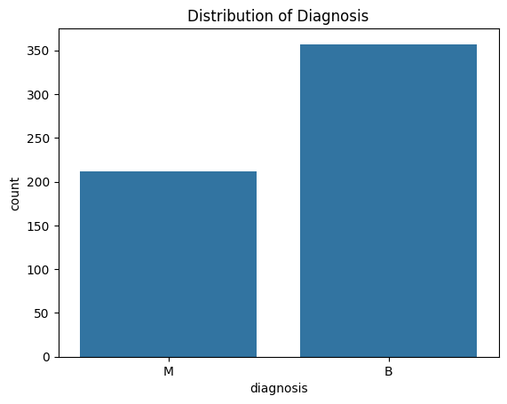
The subfolders in the test dataset bearing the labels “benign” and “malignant” replicated how the training data was arranged. The consistency in assessing the model’s capacity to generalize to previously unseen images was made possible by its adherence to structure. After carefully preparing the test data using the same preprocessing methods used for training, we loaded the trained model and started making predictions.

The results of my testing efforts indicated that the performance was encouraging. The model demonstrated its capacity to accurately diagnose skin lesions as either benign or malignant, with an accuracy rate of 90.2%. Even while it shows success, this numerical depiction merely scratches the surface of the knowledge gained from a closer look.

As we looked more closely at the categorization report, we found that the F1-score, precision, and recall were important metrics. The model’s 88% precision and 93% recall for benign lesions demonstrate its capacity to accurately identify benign instances while reducing false positives. On the other hand, recall and precision for malignant lesions were 87% and 93%, respectively. In the context of skin cancer detection, where incorrect categorization can have serious repercussions, these measures represent a balanced performance, which is crucial. The model’s balanced performance across classes is further highlighted by the weighted averages and macros. When a model achieves a macro average of 90% for precision, recall, and F1-score, it indicates that it is not very successful in one class at the expense of another.

We have to acknowledge that precision is all about decimal places. The models we create reflect a commitment to being as careful and watchful as we can be—they are more than just tools. As we continue to push the limits of what technology can accomplish in healthcare, we’re dedicated to improving our strategy, picking up new skills from every experience, and helping to ensure that no case goes unnoticed in the future.

Profound conviction that accuracy is not only a goal but also a duty in the delicate field of cancer diagnosis propels the path forward.

Wisconsin Breast Cancer Diagnosis: SVM Analysis

Worldwide, breast cancer is the most frequent cancer to affect women. It affects about 2.1 million people in 2015 alone and makes up 25% of all cancer cases. It all begins when breast cells start to proliferate uncontrollably. Usually, these cells develop into tumors that are felt as lumps in the breast area or that are visible on X-rays.

The main obstacle to its discovery is determining whether a tumor is benign (not cancerous) or malignant (cancerous). Let’s finish the analysis of the Breast Cancer Wisconsin (Diagnostic) Dataset and machine learning (with SVMs) to classify these tumors.

Understanding the Dataset: There are several features in our dataset that are essential for identifying breast cancer, making it a veritable gold mine of information. Measurements of the radius, texture, area, perimeter, smoothness, compactness, concavity, concave points, symmetry, and fractal dimension are some of these characteristics. Every one of these factors offers some insight into the complex realm of biological traits connected to breast cancers.

The Correlation Matrix:
Making a correlation matrix is one of our initial exploration’s procedures. The strength and direction of the correlations between the various variables in our dataset are shown below.

Negative correlations imply a propensity for one variable to fall as another rises, and positive correlations point to variables that tend to increase together. The secret to comprehending the intricate interactions between the features in our dataset is found in this dance of relationships.

Determining the diagnosis distribution in our dataset is a critical component of our research. The diagnosis of breast tumors and their classification as benign or malignant are included in our dataset.

SVMs in machine learning and the Breast Cancer Wisconsin (Diagnostic) Dataset will be my tools for classifying these tumors. A potent supervised machine learning approach for regression and classification problems is called Support Vector Machines (SVM). Finding the hyperplane that best divides the data into distinct classes is the goal of support vector machines (SVM) in classification. Support vectors are the data points that are closest to the hyperplane, and this hyperplane was selected to optimize the margin between the classes.

Before we get started, let’s refresh your understanding of SVMs. It’s a potent supervised machine learning approach for regression and classification problems is called Support Vector Machines (SVM). Finding the hyperplane that best divides the data into distinct classes is the goal of support vector machines (SVM) in classification. Support vectors are the data points that are closest to the hyperplane, and this hyperplane was selected to optimize the margin between the classes.

I’ll use pairplot to find patterns and connections between feature pairs. A layman may find this intimidating, but it’s not that difficult. To compare the relationship between specific features for distinct classes, the histograms along the pair plot’s main diagonal are not required. The scatter plots in the off-diagonal positions are more helpful when you are interested in relationships between pairs of data, as they display the distribution of each individual feature. Because of the vast number of pairings, I’ll present a section to provide a glimpse of the pairplot:


A single data point from the dataset is represented by each point in the scatter plot. For example, the “radius_mean” value for a given data point is equal to the x-coordinate of that point. For the same data point, the y-coordinate and “texture_mean” value match. The “diagnosis” variable determines the point’s color: benign tumors (“B”) are represented by blue points, whereas malignant tumors (“M”) are represented by orange points.

Why are we doing this? When examining scatter plots for classification tasks, you may want to search for trends or patterns that point to a potential class boundary. A visual line that visibly divides most blue spots from orange points, for instance, suggests that these two characteristics may be useful in the tumor classification process. But when there are more pairs in a pair plot, it gets harder to visually identify linear separability. Nevertheless, you might use a few strategies to concentrate on feature pairings that could be instructive. So we can once again use the correlation matrix, as I believe features with a higher correlation with the target variable (diagnosis) might be more relevant for linear separability.

For a variety of reasons, it may not be feasible or effective to go over every pair in a pair plot for feature analysis. Finding significant patterns or trends is difficult due to the sheer number of plots, and it could result in information overload. Pair plots are useful for showing the correlations between two variables, but they might not be able to depict more intricate interactions between several characteristics at once. Concentrating only on pairwise relationships may cause certain significant patterns or dependencies to be missed. However, it provides you with a general notion of the features that could matter and be decisive.

Instead of doing a correlation analysis, I performed an ANOVA (study of Variance). When working with categorical target variables (in this case, “diagnosis,” with categories “Malignant” and “Benign”), ANOVA is a wonderful concept. ANOVA evaluates if there are statistically significant differences in the means of continuous features within and between target variable categories. It assists in locating characteristics whose typical values could vary depending on the diagnosis group. However, when the target variable is categorical, correlation cannot be directly used. Instead, correlation evaluates the magnitude and direction of a linear relationship between two continuous variables.

Feature Selection: I was able to choose features by using the p-value that I got from the ANOVA testing.
Why Select Only Some Features? Features that exhibit a low p-value (< 0.05) in relation to the target variable are deemed statistically significant. This phase is done in order to highlight characteristics that exhibit notable variations in means between various diagnosis groups. Restricting the selection of attributes to those that are pertinent can streamline the model and enhance its interpretability.

Dimensionality reduction is what we could have done if there were a lot more features. When working with a big number of features, one method for reducing dimensionality is Principal Component Analysis. In this instance, PCA is not required because the emphasis is on utilizing ANOVA to choose particular features based on each feature’s unique relevance and the characteristics that are chosen are not overly many. Also, too few principle components can cause underfitting, in which the model is unable to adequately represent the complexity of the data. However, if a model has too many components, it may overfit the training set and not be able to generalize well to new, unobserved data. When it’s necessary to minimize the number of features while maintaining the greatest amount of variation, PCA becomes increasingly pertinent.

The relevance of standard error

I tried to create an SVM model using every feature that was provided before use ANOVA to implement feature selection. Just 62% of the initial attempt’s results were accurate. This suggests that adding all characteristics, such as ‘texture_se,”smoothness_se,”symmetry_se,’ ‘fractal_dimension_se,’, may have affected the model’s performance by adding noise or unnecessary data. It’s possible that the “se” features (standard error features) don’t have a significant predictive value for differentiating between benign and malignant cases. These are some possible explanations for why ‘se’ features might not be as educational. Features that are biologically significant to the disease are frequently given priority in cancer research. The emphasis may be on characteristics that directly reflect fundamental biological processes connected to tumor genesis, progression, and treatment response, even though precision and variability are significant in some analyses.

When these’se’ features were eliminated, the accuracy of the SVM model increased dramatically to 95%. In order to improve the model’s discriminatory strength and concentrate on the most pertinent data for breast cancer prediction, certain features were decided to be excluded.

When the features were sorted based on their p-values from the ANOVA tests, the top 5 relevant features were identified as follows:

  1. concave points_worst
  2. perimeter_worst
  3. concave points_mean
  4. radius_worst
  5. perimeter_mean
  • Concave Points (Worst and Mean): Concave points refer to the number of concave portions (indentations) in the contour of the breast mass. The presence and distribution of concave points can provide insights into the irregularity and complexity of tumor shapes, potentially indicating malignant characteristics.
  • Perimeter (Worst and Mean): Perimeter measures the length of the outer boundary of the tumor. Tumor perimeter reflects the extent of tumor spread and invasion, with larger perimeters potentially associated with more advanced or aggressive tumors.
  • Radius (Worst): Radius refers to the average distance from the center to points on the tumor boundary. Larger tumor radii may suggest larger tumor sizes, which can be a relevant factor in determining tumor aggressiveness.

These features were found to be among the top contributors to the model, indicating that the information they contain may be useful in differentiating between cases that are benign and those that are malignant.

Conclusion

The Wisconsin dataset for breast cancer was first presented. It contained a number of parameters pertaining to the characteristics of the tumor in addition to the goal variable “diagnosis,” which indicated whether the tumor was malignant (M) or benign (B).
An early attempt to create an SVM model with every attribute produced an accuracy of only 62%, which was considered low. This finding suggested that feature selection might be necessary to enhance the model’s functionality.We used ANOVA, or analysis of variance, to determine which factors were most important for predicting breast cancer. After selecting features with significant p-values, it was found that the accuracy of the model increased to 95% when some standard error (‘se’) features were eliminated.

It was determined that some features were too important. These variables indicated components of tumor characteristics that were relevant both clinically and physiologically.

Despite being a highly effective dimensionality reduction method, Principal Component Analysis (PCA) was not considered necessary here. The accuracy of the model improved when standard error features, for example “texture_se,” were removed because it was determined that they were not as informative for predicting breast cancer.

References

Dataset: https://www.kaggle.com/datasets/yasserh/breast-cancer-dataset

Getting Ahead in Advanced Mathematical Statistics: From Novice to Adept

When I started the Advanced Mathematical Statistics course, I found myself on the verge of mathematical complexities, armed with resolve but lacking in expertise. I had no idea that this journey would turn out to be a transforming odyssey, with the leadership of a fantastic professor serving as the North Star of my academic expedition.

The first steps were hesitant, with complicated theorems and abstract concepts threatening to overwhelm. The seemingly overwhelming became a conquerable obstacle. Lessons went beyond textbooks, bringing theories to life and making statistics more approachable.

Traditional statistics training frequently focuses on abstract theories and formulaic applications. The projects in this course, on the other hand, broke that mould, necessitating an application-driven approach. Working with real-world datasets taught me that statistics is more than just numbers and formulas, it is a dynamic instrument for pulling valuable insights from the chaos of raw data.


Practical Applications: Each project posed a new challenge, requiring the use of statistical approaches I had never heard of before to tackle complex, multilayered problems. The projects stretched the bounds of understanding, from analysing economic data to anticipating future trends. They were more than just exercises; they led to a deep realisation: the true strength of statistics lay in its ability to uncover patterns, forecast outcomes, and inform decision-making. Through these projects, abstract statistical concepts found resonance in practical scenarios. The datasets served as a blank canvas on which hypotheses could be tested, developed, and changed to meet the complexities of real-world scenarios. As I studied economic indicators, police shootings, and health indicators, I saw statistical tools transform from abstract entities to crucial decision-making tools.

These course projects not only improved my statistical knowledge but also shaped my attitude to problem solving. I am more prepared to face the statistical difficulties that await me in the professional landscape now that I understand statistics is a dynamic instrument for prediction and analysis. It breathed life into abstract theories, transformed statistical methods into pragmatic tools, and equipped me with the skills to navigate the intricacies of real-world data.

A great Professor like Gary Davis can turn a difficult subject into an exciting adventure. Patiently answering questions, providing real-world applications, and creating a collaborative environment.

As I bid farewell to the course, I take with me not only new knowledge but also a deep respect for education’s transformational power and the importance of an inspiring mentor. The voyage began with doubt, but it ends with a sense of accomplishment, thankfulness, and the eagerness to apply statistical expertise in the future.


Forecasting Boston’s Future: A time series exploration

I’m delighted to present this extensive report, offering a detailed time series analysis of economic indicators data sourced from Analyze Boston. We discovered remarkable patterns, correlations, and forecast insights through careful examination and use of statistical approaches. This study not only examines the historical trends of international flights at Logan International Airport, but it also delves into the complicated relationships with other economic aspects such as unemployment rate. The process of differencing, modelling, and forecasting has provided vital insights into the data’s dynamic nature. I’m excited to publish this comprehensive report, which highlights the breadth and depth of our exploration.

Report

MTH522 Snapshot (Part 2)

Fundamentally, statistics is the foundation upon which machine learning models are built. The conceptual framework for comprehending uncertainty, variability, and patterns in data is provided by the concepts of statistical inference, hypothesis testing, and probability theory. The ability to interpret data distributions, estimate parameters, and express the degree of confidence in predictions is provided by statistical approaches, which are a necessary starting point for any machine learning project.

Essentially, machine learning models are complex algorithms based on statistical concepts. Statistical techniques serve as the foundation for model training and evaluation, whether the model is a complicated deep neural network learning intricate patterns or a linear regression model using least squares for parameter estimation. Machine learning algorithms are intimately involved with statistical notions such as variance, bias, and generalisation as they traverse through large datasets.

Model Validation Techniques: The use of validation techniques is essential to guaranteeing the stability of statistical models. Together, these subjects provide the framework for model validation:

  • Validation Process
    Cross-validation is one method of evaluating model performance that is included in validation. These methods prevent overfitting and help assess the model’s capacity for generalisation.
  • Evaluation Metrics
    Within the validation process, various evaluation metrics quantify the performance of a model. These metrics, including Mean Squared Error (MSE), Mean Absolute Error (MAE), and R-squared, provide numerical measures to assess predictive accuracy and guide model adjustments.

Regression Analysis: The foundation of statistical modelling is regression analysis, and the evaluation measures that follow are essential for determining how accurate regression models are. The following subjects are connected in a close way:

  • Regression Analysis
    Relationships between variables are established by regression analysis, whether it is linear or nonlinear. It is an essential method for estimating parameters with approaches such as the least squares approach.
  • Metrics of Evaluation: R-squared, MAE, and MSE
    Regression model-specific evaluation metrics, such as MSE, MAE, and R-squared, quantify prediction accuracy and direct refinement efforts to maximise model performance.
  • Residuals Analysis
    Regression analysis is enhanced by the examination of residuals, or the variations between observed and predicted values. Remaining analysis directs modifications to satisfy model assumptions and aids in spotting trends and anomalies.

    • The differences between the observed (actual) and anticipated values from a statistical model are known as residuals.
    • The primary goal of residual analysis is to assess how well a statistical model fits the observed data.
    • Examining the distribution of residuals can assist determine whether they follow a normal distribution. Certain statistical tests and confidence intervals require normality assumptions.
    • The variance of residuals should be constant across all levels of the independent variable. Homoscedasticity ensures that the spread of residuals remains consistent, showing that the predictive power of the model is uniform.
  • Breusch-Pagan Test
    Regression analysis makes use of a diagnostic tool called the Breusch-Pagan test. It ensures the dependability of regression model findings by assisting in the detection of heteroscedasticity

Techniques for Visualisation and Clustering: Putting similar things together improves comprehension of various exploratory methods:

  • Clustering
    Similar observations are grouped together using clustering techniques like k-means and hierarchical clustering, which make patterns and relationships in the data visible. The process of clustering makes data separation easier for focused examination.
  • Heat Maps
    One visualisation approach that gives complex relationships in data an easy-to-understand depiction is heat mapping. When used in statistical analysis, heat maps work especially well for showing results from hierarchical clustering and correlation matrices.

Simulation and Hypothesis Testing: Simulation methods and hypothesis testing are vital components in statistical analysis. The following topics coalesce under this thematic grouping:

  • Monte Carlo Simulation
    Monte Carlo Simulation, a powerful tool, models complex systems through random sampling. Running simulations iteratively allows for a comprehensive understanding of the range of possible outcomes and associated probabilities. It basically involves generating a large number of random samples to model the behavior of a system. These random samples are used to estimate probabilities and analyze the distribution of possible outcomes.
  • ANOVA Test
    The Analysis of Variance (ANOVA) test, a hypothesis testing technique, assesses differences in means among multiple groups. ANOVA extends t-tests, providing a comprehensive analysis of variance components.

a little more about Hypothesis testing..

One and Two-tailed tests

  • A one-tail test (sometimes known as a one-sided test) in statistical hypothesis testing focuses on a certain direction of the hypothesis. The key zone, where we determine if the sample data falls into the distribution, is only on one side of the distribution curve.


    • For example, if a new drug is being tested to see if it enhances average recovery time, a one-tail test would look to see if the recovery time is considerably less (shorter) with the drug.
  • A two-tail test (or two-sided test) takes into account both directions of the hypothesis. The critical zone is divided between the distribution curve’s two tails. A two-tail test, for example, would determine whether the recovery time is significantly different (either shorter or longer) with the medicine than without.

MTH522 Snapshot – My Dive into Advanced Stats (Part 1)

In this brief overview, we’ll delve into the core concepts that define this course, shedding light on the heightened complexities of probability, inference, and statistical methodologies. Join me in this concise recap, as we unravel the key insights gained from the advanced math stats coursem a journey that elevated my statistical understanding to new heights.

  1. Descriptive statistics are a group of statistical approaches that are used to summarise and characterise the principal characteristics of a dataset. These strategies provide a clear and informative overview of the data’s key qualities. These methods go beyond simple numerical values, providing a more nuanced view of data distribution, central tendency, and variability. In this essay, we dig into the vast world of descriptive statistics, looking at the numerous measurements and approaches statisticians use to extract valuable insights from large datasets.
    • Central Tendency Measures: Provide insights into the typical or average value of a dataset. The mean, or average, is a simple measure of central tendency, whereas the median represents the centre point, which is less influenced by extreme values. The mode indicates the most often occurring value, providing a thorough insight of the dataset’s key trends.
    • Dispersion Measures: Reveal the spread or variability within a dataset. The range is a basic yet informative statistic that quantifies the difference between the maximum and least values. In contrast, variance and standard deviation provide a more sophisticated view of how data points differ from the mean. A low variance indicates that the values tend to be close to the mean. The standard deviation represents the average distance of data points from the mean, providing a clearer understanding of the spread. These metrics provide a more in-depth examination of the distribution’s shape and concentration.
    • Shape and Distribution: Kurtosis and skewness appear as important factors in determining the shape of a distribution. Kurtosis evaluates tail behaviour by identifying distributions with heavier or lighter tails than the typical distribution. Skewness, on the other hand, is a measure of asymmetry that reveals whether a distribution is skewed to the left or right. Together, these measurements help to paint a complete picture of the dataset’s structural complexities. What we want is a normal distribution, that is perfect symmetry. When data approximates a normal distribution, statistical methods and tests tend to be more valid and reliable.
    • Visualization Techniques: Using graphical representations to aid comprehension. Frequency distributions and histograms depict the distribution of values across categories or ranges. The five-number summary is encapsulated in box-and-whisker charts, which provide a short view of the dataset’s variability. These graphic tools make interpretation and communication more accessible.
    • Additional Dimensions: Descriptive statistics go beyond the basics, including concepts like interquartile range (IQR), coefficient of variation (CV), and position measurements like z-scores and percentile ranks.
      • A higher IQR indicates more fluctuation in the central section of the dataset where majority of points are situated that is usually the first standard deviation, whereas a lower IQR shows more concentrated data.
      • Positive z-scores indicate data points above the mean, while negative z-scores indicate points below. A z-score of 0 means the data point is at the mean. This measure helps identify outliers and understand the relative position of individual data points within the distribution.
      • A percentile rank of 75% indicates that the data point is greater than or equal to 75% of the values in the dataset. It gives a relative location measure, which is particularly useful when comparing individual data points across datasets.
      • If the CV is high, it implies that the standard deviation is a significant proportion of the mean. In a dataset of monthly income, a high CV would indicate that individual incomes vary widely in relation to the average income.
  2. Multivariate Probability Distributions
    • While univariate probability distributions are limited to a single random variable, multivariate probability distributions contain numerous variables at the same time. Exploration of multivariate probability distributions is critical for understanding the intricate interdependencies and interactions among variables, and it provides a rich toolkit for advanced statistical research.
    • The joint probability density function (PDF) or probability mass function (PMF) expresses the likelihood of various outcomes for the complete collection of variables and serves as the cornerstone of multivariate probability.  In PDF the area under the curve between a and b gives the likelihood of the random variable falling within a certain interval [a,b]. While PDF is used for continuous variables, PMF is used for discrete random variables, which can take distinct values. It gives the probability of the random variable taking on a specific value. The PMF assigns a chance of 1/6 to each of the six potential outcomes for a fair six-sided dice (1, 2, 3, 4, 5, 6).
    • Multivariate Normal Distribution: Provides a way to model joint distributions of two or more random variables. The multivariate normal distribution is characterized by a mean vector and a covariance matrix, and it plays a crucial role in various statistical analyses.Source
      • Take any linear combination of the variables, the resulting distribution remains normal.
      • The Central Limit Theorem (CLT) states that the sum (or average) of a large number of independent and identically distributed random variables follows a normal distribution. Because of this, it is an obvious choice for modelling the joint distribution of numerous variables.
      • To put it simply, the multivariate normal distribution allows us to simulate the combined behaviour of numerous variables. The mean vector represents the major trends, while the covariance matrix describes how these variables interact with one another.
    • Correlation and covariance: The covariance matrix represents the degree of linear dependency or independence of variables. A positive covariance suggests a positive linear relationship, whereas a negative covariance suggests a negative linear relationship. The correlation matrix, which is produced from the covariance matrix, standardises these correlations by providing a score ranging from -1 to 1, with 0 signifying no linear correlation.
    • Distribution Multinomial: Important in discrete multivariate distributions. It applies the binomial distribution notion to circumstances with more than two possible outcomes. Binomial is when 2 possible outcomes(true or false) and Multinomial is when there are multiple categories or outcomes. Using the distribution, we can calculate the expected number of occurrences for each category over a series of trials. This helps in understanding the average or expected distribution of outcomes. So the multinomial distribution, which is frequently used in categorical data analysis, predicts the chance of finding differing counts across numerous categories, making it useful in domains as diverse as genetics, marketing, and survey analysis.
      • Let’s consider an example, imagine rolling a six-sided die multiple times. The categories, in this case, are the numbers 1 through 6 on the die.
  3. Statistical Inference: Statistical inference, at its core, bridges the gap between raw observations and meaningful conclusions by offering a framework for making informed judgements based on uncertain information.
    • Probability is the language that statisticians use to measure uncertainty and model the unpredictability that exists in data. The shift from probability theory to statistical inference is highlighted by a change from explaining chance events to making population-level judgements based on sample data.
    • Estimation theory: Estimation, a fundamental part of statistical inference, addresses the problem of deriving useful information about population parameters from a small sample size. Maximum Likelihood estimate (MLE) and Bayesian estimate are two popular methods. MLE seeks parameter values that maximise the likelihood of observed data, whereas Bayesian estimating uses prior knowledge to update parameter beliefs.
    • Hypothesis testing: Provides a disciplined process for making judgements in the face of confusion. Statisticians formulate hypotheses about population parameters and use sample data to assess the evidence against a null hypothesis.
      • Uncovering Mean Differences with the T-Test: When working with tiny sample sizes, the t-test is very beneficial, as the standard z-test may be difficult due to the unknown population standard deviation. There are several types of t-tests, each adapted to a certain case. The independent two-sample t-test, which compares the means of two independent groups, is the most commonly used. The null hypothesis (H0) states that there is no significant difference between the means of the two groups in a typical scenario.
      • P-Values as a Measure of Evidence: The concept of p-values is critical for interpreting t-test findings. The p-value shows the likelihood of receiving observed outcomes, or more extreme results, if the null hypothesis is true. It measures the strength of evidence against the null hypothesis. A low p-value (usually less than a preset significance level, such as 0.05) indicates that the observed data is implausible under the null hypothesis.
    • Asymptotic Theory: As data sizes get larger, statisticians resort to asymptotic theory to understand how estimators and tests behave. Under specific conditions, the Law of Large Numbers and the Central Limit Theorem become guiding principles, ensuring practitioners that statistical processes converge to genuine values and follow normal distributions.
    • Bayesian Statistics:By adding previous knowledge into the inference process, Bayesian statistics introduces a paradigm shift. Bayesian inference provides a consistent framework for integrating current knowledge with new information, which is especially useful in sectors with limited data.
    • Challenges and Solutions: Statistical inference is not without its challenges. Among the challenges that statisticians face include overfitting, model misspecification, and the p-value debate. In the face of these obstacles, robust statistics and resampling methods, such as bootstrapping, offer solutions to improve the reliability of inference.
  4. Asymptotic Theory: Provides a powerful framework for analysing the behaviour of statistical procedures as sample sizes increase indefinitely. Asymptotic results, which are rooted in probability theory, provide light on the limitations of statistical inference, providing essential insights into the stability and reliability of estimators and tests. It extends probability theory’s foundations by investigating the convergence behaviour of random variables. The Law of Large Numbers and the Central Limit Theorem serve as foundational principles, indicating the tendency of sample averages to converge to population means and the formation of normal distributions in the sums of independent random variables.
    • However, this goes beyond the immediate scope of the current curriculum.

Stationarity Dilemmas in Time Series Analysis (ADF and KPSS)

We are going to talk about the KPSS(Kwiatkowski-Phillips-Schmidt-Shin) test today. It is employed to evaluate a time series’ stationarity. But wait, do we really need this test given we’ve already reviewed the ADF (Augmented Dickey-Fuller) test for stationarity? Let’s investigate.

KPSS Test:

  • Null Hypothesis: The time series is stationary around a deterministic trend.
  • Alternative Hypothesis : The time series has a unit root (non-stationary).
  • Test Statistic: The KPSS test statistic is based on comparing the variance of the observed series around a deterministic trend to the variance of a random walk (non-stationary) around a deterministic trend.
  • Interpretation:
    • If the test statistic is less than a critical value, you fail to reject the null hypothesis, suggesting stationarity. (Stationary)
    • If the test statistic is greater than a critical value, you reject the null hypothesis of stationarity. (Non Stationary)

What exactly is stationarity around deterministic trend? Let’s say the statistical properties of the temperature data (like the average temperature or the variability) remain roughly the same over time, you have a stationary time series. It’s like the weather patterns are consistent. Now, let’s say there’s a clear, predictable pattern (deterministic trend) in the temperature data, like a gradual increase every year. This is a deterministic trend, it follows a known, consistent pattern.

You can state that your data is stationary around a deterministic trend if the annual average temperature rises reliably but statistical characteristics (such as the monthly average temperature) do not change significantly.

In simple terms, it’s similar to having a stable set of weather patterns (called stationarity), but within that, there is also a trend that is predictable (such as an annual rise in temperature).

What distinguishes it from the ADF test? All that defines stationarity are two things: no regular patterns (trends or seasonality) and a constant mean and variance. Stationarity in the context of the ADF test refers to the absence of a unit root in a time series. Refer https://spillai.sites.umassd.edu/2023/11/17/day-2-with-with-tsfp-by-marco-peixeiro/  for better understanding about unit roots and the ADF test. Essentially, presence of a unit root is bad and it implies that that the series has a long-term memory or persistence in its random fluctuations.

Let’s consider 4 cases.

  1. Both ADF and KPSS say “Stationary” : This is a ideal scenario. The time series is stationary, according to both tests.
  2. ADF says “Non-Stationary,” KPSS says “Stationary”: This is called trend-stationary. A trend-stationary time series is one that may be made stationary by removing a deterministic trend. The mean, variance, and autocorrelation structure of the series change gradually over time due to a systematic and predictable trend and that needs to be removed.
  3. ADF says “Stationary,” KPSS says “Non-Stationary”: This is called difference-stationary. A time series is difference-stationary if it becomes stationary after differencing. Remember how we applied second order differencing on flight data before our ADF test cleared us for stationarity?
  4. Both ADF and KPSS say “Non-Stationary”: Ouch. Both tests suggest the presence of a unit root or a trend that needs addressing.

Keep in mind that the null hypothesis of the ADF test is that the time series has a unit root, indicating non-stationarity, and you want to reject it. While the null hypothesis of the KPSS test is that the time series is stationary around a deterministic trend, and that is welcome.When the ADF and KPSS tests produce contradictory results, there is no hard and fast rule for giving more weight to one test over the other. The decision is influenced by a number of things, including your judgement and the features of the data.

Allow me to return to our ‘Analyse Boston’ data collection called economic-indicators once again.

Even after first order differencing, the ADF test indicates that the logan international flight data is non-stationary, even though KPSS indicates that it is. If KPSS suggests stationarity, it implies that the data may be stationary around a trend, and differencing might not be necessary.

  • Some models, such as the autoregressive integrated moving average (ARIMA) model, are intended for non-stationary data and can directly contain differencing.
  • Other models, such as autoregressive (AR) and moving average (MA), presuppose stationarity and may necessitate differencing.

Anything in time series is often an iterative process. To determine the optimal approach for your data, you may need to experiment with different transformations and model specifications.

Now comes the interesting part. If you remember, a second-order differencing approach was used in our initial analysis of the flight data until the Augmented Dickey-Fuller (ADF) test indicated non-stationarity, despite the Kwiatkowski-Phillips-Schmidt-Shin (KPSS) test indicating stationarity after first-order differencing. The differenced data was then fitted with autoregressive (AR) and moving average (MA) models. The model was chosen by minimising the Akaike Information Criterion (AIC). The resulting AR model had a Mean Absolute Error (MAE) of around 175, whereas the MA model had an MAE of around 275.

When the differencing technique was revisited and we stopped with the differencing when KPSS revealed stationarity, the AR model’s performance improved, providing a lower MAE of 98. The MA model’s performance, on the other hand, declined, resulting in an increased MAE of 350.

This observed change in model performance is related to the differencing approach adjustment.

  • Initially, continuing with differencing until ADF signalled non-stationarity most likely caused excessive differencing, negatively damaging our models.
  • Following that, stopping the differencing at the point of KPSS-identified stationarity allowed for a more appropriate balance, resulting in enhanced AR model performance with a lower MAE of 98.
  • This adjustment, however, resulted in an increased MAE of 350 for the MA model, emphasising the significance of prudent differencing in time series modelling.
  • AR models record dependencies based on lag values, and over-differencing might impair the model’s capacity to recognise patterns in data.
  • The MA model might be responding to the reduced differencing by emphasizing noise or fluctuations that were suppressed during excessive differencing

Sometimes, less differencing is more, but models can be a bit moody about it. You have find that sweet spot. By stopping differencing when one of the tests(KPSS) confirmed stationarity and ending up with a better model proved to us that the original series was closer to stationarity without the need for further differencing.

Trend Analysis: STL Decomposition

Let us return to our Economic Indicators dataset to discuss trends and seasonality.

We can determine whether there is a long-term trend in any of the economic indicators (like the number of international flights at Logan International Airport) using Time series analysis techniques. A common method is to plot historical data on international flight counts over time. This graphical representation allows you to visually inspect the data for patterns, trends, and potential seasonality.

  • From 2013 to 2015, there is an initial upward trend, indicating a gradual increase in the number of international flights.
  • From 2015 to 2016, the plot steepens, indicating a faster increase in international flights during this time period. This could indicate a period of rapid growth or a shift in influencing factors.
  • From 2016 to 2018, the plot maintains the same angle as in the previous years (2013 to 2015). This indicates a pattern of sustained growth, but at a relatively consistent rate, as opposed to the sharper increase seen in the previous period.

To extract underlying trends, we could also calculate and plot a moving average or use more advanced time series decomposition methods. These techniques can assist in identifying any long-term patterns or fluctuations in international flight counts, providing valuable insights into the airport’s long-term dynamics.

Moving Average: A moving average is a statistical calculation that is used to analyse data points by calculating a series of averages from different subsets of the entire dataset. A “window” denotes the number of data points in each average. The term “rolling” refers to the calculation being performed iteratively for each successive subset of data points, resulting in a smooth trend line.

  • Let’s take the window as 12.
  • Averages and subsets: Each subset of 12 consecutive points in the dataset is considered by the moving average.
    • For each subset, it computes the average of these 12 points.
    • As the window moves across your flight data, there will be N-12+1 subsets (N is the number of total datapoints you have)
    • The Average (x) is interpreted as follows: Assume the first window’s average is x. This x is the smoothed average value for that specific time point. It is the 12-month average of the ‘logan_intl_flights’ value.
  • Highlighting a Trend: The moving average’s purpose is to smooth out short-term fluctuations or noise in the data.
  • The Orange Line in Context: The orange line’s peaks and valleys represent data trends over the specified window size. If the orange line rises, it indicates an increasing trend over the selected time period. If it is falling, it indicates a downward trend.
    When compared to the original data, the fluctuations are less abrupt, making it easier to identify overall trends.
  • A confidence interval around the moving average is typically represented by the light orange region. A wider confidence interval indicates that the data points within each window are more uncertain or variable.

STL or Seasonal-Trend decomposition using LOESS is a time series decomposition method that divides a time series into three major components: trend, seasonal, and residual. Each component is described below:

  • Before we do the STL decomposition, let’s understand what frequency is. Because STL is based on the assumption of regular intervals between observations, having a well-defined frequency is critical.
    • Not every time series inherently has a well-defined frequency. While some time series data may naturally exhibit a regular and consistent pattern at specific intervals, others may not follow a clear frequency.
    • How do check if your time series has a well defined frequency?
    • After you set the Date as your index, you can check using df.index.freq to see what the frequency is. If it’s ‘None’, you will have to explicitly set it.
    • df.index.to_series().diff().value_counts(): This will show you the counts of different time intervals between observations in your time series. Observe the most common interval, as it is likely the frequency of your time series.
    • The idea is to observe the most common interval, which is likely the frequency of your time series. The output helps verify that the chosen frequency aligns with the actual structure of the
    • data.df.index.freq = ‘MS’: This explicitly sets the frequency of the time series to ‘MS’, which stands for “Month Start.”
    • Based on this assumed frequency, it decomposes the time series into seasonal, trend, and residual components. By explicitly setting the frequency, you ensure that STL correctly interprets the data and captures the desired patterns.
  • Trend Component: The trend component in time series data represents the long-term movement or underlying pattern. It is created by smoothing the original time series with a locally weighted scatterplot smoothing (LOESS). LOESS is a non-parametric regression technique that fits data to a smooth curve

  • Seasonal Component: The seasonal component captures recurring patterns or cycles that occur over a set period of time.
    STL, unlike traditional seasonal decomposition methods, allows for adaptive seasonality by adjusting the period based on the data. The seasonal component values represent systematic and repetitive patterns that occur at a specific frequency, typically associated with seasons or other regular data cycles. These values, which can be positive or negative, indicate the magnitude and direction of the seasonal effect.

  •  Residual Component: After removing the trend and seasonal components, the residual component represents the remaining variability in the data. It is the “noise” or irregular fluctuations in time series that are not accounted for by trend and seasonal patterns.

Now what is this residual component? If you look, your original time series data has various patterns, including seasonal ups and downs, a long-term trend, and some random fluctuations. Residuals are essentially the leftover part of your data that wasn’t explained by the identified patterns. They are like the “random noise” or “unpredictable” part of your data. It is nothing but the difference between the observed value and the predicted value. I plan on addressing the entire logic behind this in a separate blog.

So technically, if your model is good, the residuals should resemble random noise with no discernible structure or pattern.
And if you see a pattern in your residuals, it means your model did not capture all of the underlying dynamics.

Which months do you believe have the highest number of international flights? Take a wild guess. Is it around Christmas, Thanksgiving, umm.. Valentine’s Day?

We can isolate and emphasise the recurring patterns inherent in international flight numbers by using the seasonal component obtained from STL decomposition rather than the original data. The seasonal component represents the regular, periodic fluctuations, allowing us to concentrate on the recurring variations associated with different months.

By analysing this component, we can identify specific months with consistently higher or lower international flight numbers, allowing us to gain a better understanding of the dataset’s seasonal patterns and trends. This method aids in the discovery of recurring behaviours that may be masked or diluted in raw, unprocessed data.

The month with the highest average seasonal component is represented by the tallest bar. This indicates that, on average, that particular month has the most flights during the season. Shorter bars, on the other hand, represent months with lower average seasonal effects, indicating periods with lower international flight numbers. Based on the seasonal patterns extracted from the data, analysing the heights of these bars provides insights into seasonal variations and helps identify which months have consistently higher or lower international flight numbers.

Fun Time Series Analysis: Apple Stock Price Forecasting

Why don’t we do something more intriguing now that we have a firm understanding of time series? For those who share my curiosity, stocks offer a captivating experience with their charts, graphs, green and red tickers, and numbers. But, let’s review our understanding of stocks before we get started.

  • What is a Stock? A stock represents ownership in a company. When you buy a stock, you become a shareholder and own a portion of that company.
  • Stock Price and Market Capitalization: The stock price is the current market value of one share. Multiply the stock price by the total number of outstanding shares to get the market capitalization, representing the total value of the company.
  • Stock Exchanges: Stocks are bought and sold on stock exchanges, such as the New York Stock Exchange (NYSE) or NASDAQ. Each exchange has its listing requirements and trading hours.
  • Ticker Symbol: Each stock is identified by a unique ticker symbol. For example, Apple’s ticker symbol is AAPL.
  • Types of Stocks:
    • Common Stocks: Represent ownership with voting rights in a company.
    • Preferred Stocks: Carry priority in receiving dividends but usually lack voting rights.
  • Dividends: Some companies pay dividends, which are a portion of their earnings distributed to shareholders.
  • Earnings and Financial Reports: Companies release quarterly and annual financial reports, including earnings. Positive earnings often lead to a rise in stock prices.
  • Market Index: Market indices, like the S&P 500 or Dow Jones, track the performance of a group of stocks. They give an overall sense of market trends.
  • Risk and Volatility: Stocks can be volatile, and prices can fluctuate based on company performance, economic conditions, or global events.
  • Stock Analysis: People use various methods for stock analysis, including fundamental analysis (company financials), technical analysis (historical stock prices and trading volume), and sentiment analysis (public perception).
  • yfinance: yfinance is a Python library that allows you to access financial data, including historical stock prices, from Yahoo Finance.
  • Stock Prediction Models: Machine learning models, time series analysis, and statistical methods are commonly used for stock price prediction. Common models include ARIMA, LSTM, and linear regression.
  • Risks and Caution: Stock trading involves risks. It’s essential to diversify your portfolio, stay informed, and consider seeking advice from financial experts.

When working with stock data using the yfinance library in Python, the dataset typically consists of historical stock prices and related information.

Fields and Columns:

  1. Date: The date on which the stock data is recorded.
  2. Open: The opening price of the stock on a particular trading day.
  3. High: The highest price of the stock during the trading day.
  4. Low: The lowest price of the stock during the trading day.
  5. Close: The closing price of the stock on a particular trading day.
  6. Adj Close: The adjusted closing price, which accounts for corporate actions like stock splits and dividends.
  7. Volume: The number of shares traded on that particular day.

Let us examine the trajectory that the closing stock prices have followed over the course of these years.To simplify matters, we’ll exclusively rely on data from the preceding year to forecast the upcoming 7 days.

The Augmented Dickey-Fuller (ADF) test serves as the gatekeeper, gauging the stationarity of our time series. An initial non-stationary state prompts the application of differencing, ushering in a transformed and predictable time series.

Next, navigating the parameter landscape becomes crucial. The AutoCorrelation Function (ACF) plot guides us to the optimal parameters—(3, 1, 2). These parameters, derived through a judicious selection process, form the backbone of our ARIMA model, setting the stage for insightful predictions.

Delving into the model’s coefficients, we uncover the intricate dance between AutoRegressive (AR) and Moving Average (MA) terms. The model adeptly captures historical trends and responds to current market nuances, revealing a nuanced narrative.

Diagnostics become the litmus test for our model’s reliability. The Ljung-Box test and Heteroskedasticity test affirm the model’s resilience, ensuring it stands up to scrutiny. Residual analysis further unravels any hidden patterns, validating the model’s transparency.

  • A small lb_stat value suggests that the autocorrelations at the corresponding lag are close to what would be expected under the null hypothesis of no autocorrelation.
  • A large lb_stat value indicates that the autocorrelations at the corresponding lag deviate significantly from what would be expected under the null hypothesis

Metrics take centre stage in evaluating performance. Mean Squared Error (MSE), Root Mean Squared Error (RMSE), and Mean Absolute Percentage Error (MAPE) provide a quantitative measure of our model’s precision. Impressively low deviations (MAPE: 1.43%) underscore the model’s accuracy in predicting Apple’s stock prices.

To sum up, this data-driven journey skilfully negotiates the complexities of stock price forecasting. Our ARIMA model shows itself to be a trustworthy advisor by using past data to forecast the uncertain. With the knowledge gained from this analysis, may our foresightful and accurate forecasting efforts serve us well as we enter the dynamic world of stock markets.

Day 5 with “TSFP”

Let’s attempt a thorough analysis of our models today. Residual analysis, as we all know, is a crucial stage in time series modelling to evaluate the goodness of fit and make sure the model assumptions are satisfied. The discrepancies between the values predicted by the model and the observed values are known as residuals.

Here’s how we can perform residual analysis for your AR and MA models:

  1. Compute Residuals:
    • Calculate the residuals by subtracting the predicted values from the actual values.
  2. Plot Residuals:
    • To visually examine the residuals for trends, patterns, or seasonality, plot them over time. The residuals of a well-fitted model should look random and be centred around zero.
  3. Autocorrelation Function (ACF) of Residuals:
    • To see if there is any more autocorrelation, plot the residuals’ ACF. The ACF plot shows significant spikes, which suggest that not all of the temporal dependencies were captured by the model.
  4. Histogram and Q-Q Plot:
    • Examine and compare the residuals histogram with a normal distribution. To evaluate normality, additionally employ a Q-Q plot. Deviations from normalcy could indicate that there is a breach in the model’s presumptions.

If you’re wondering why you should compare the histogram of residuals to a normal distribution or why deviations from normality may indicate that the model assumptions are violated, you’re not alone. Normality is a prerequisite for many statistical inference techniques, such as confidence interval estimation and hypothesis testing, that the residuals, or errors, follow a normal distribution. Biassed estimations and inaccurate conclusions can result from deviations from normality.

The underlying theory of time series models, including ARIMA and SARIMA models, frequently assumes residual normality. If the residuals are not normally distributed, the model may not accurately capture the underlying patterns in the data.

Here’s why deviations from normality might suggest that the model assumptions are violated:

  1. Validity of Confidence Intervals:
    • The normality assumption is critical for constructing valid confidence intervals. The confidence intervals may be unreliable if the residuals are not normally distributed, resulting in incorrect uncertainty assessments..
  2. Outliers and Skewness:
    • Deviations from normality in the histogram could indicate the presence of outliers or residual skewness. It is critical to identify and address these issues in order to improve the model’s performance.

Let’s run a residual analysis on whatever we’ve been doing with “Analyze Boston” data.

  1. Residuals over time: This plot describes the pattern and behaviour of the model residuals, or the discrepancies between the values that the model predicted and the values that were observed, over the course of the prediction period. It is essential to analyse residuals over time in order to evaluate the model’s performance and spot any systematic trends or patterns that the model may have overlooked. There are couple of things to look for:
    • Ideally, residuals should appear random and show no consistent pattern over time. A lack of systematic patterns indicates that the model has captured the underlying structure of the data well.
    • Residuals should be centered around zero. If there is a noticeable drift or consistent deviation from zero, it may suggest that the model has a bias or is missing important information.
    • Heteroscedasticity: Look for consistent variability over time in the residuals. Variations in variability, or heteroscedasticity, may be a sign that the model is not accounting for the inherent variability in the data.
    • Outliers: Look for any extreme values or outliers in the residuals. Outliers may indicate unusual events or data points that were not adequately captured by the model
    • The absence of a systematic pattern suggests that the models are adequately accounting for the variation in the logan_intl_flights data.
    • Residuals being mostly centered around the mean is a good indication. It means that, on average, your models are making accurate predictions. The deviations from the mean are likely due to random noise or unexplained variability.
    • Occasional deviations from the mean are normal and can be attributed to random fluctuations or unobserved factors that are challenging to capture in the model. As long as these deviations are not systematic or consistent, they don’t necessarily indicate a problem.
    • Heteroscedasticity’s absence indicates that the models are consistently managing the variability. If the variability changed over time, it could mean that the models have trouble during particular times.
  2. The ACF (Autocorrelation Function) of residuals: demonstrates the relationship between the residuals at various lags. It assists in determining whether, following the fitting of a time series model, any residual temporal structure or autocorrelation exists. The ACF of residuals can be interpreted as follows:
    • No Significant Spikes: The residuals are probably independent and the model has successfully captured the temporal dependencies in the data if the ACF of the residuals decays rapidly to zero and does not exhibit any significant spikes.
    • Significant Spikes: The presence of significant spikes at specific lags indicates the possibility of residual patterns or autocorrelation. This might point to the need for additional model improvement or the need to take into account different model structures.
    • There are no significant spikes in our ACF, it suggests that the model has successfully removed the temporal dependencies in the data.
  3. Histogram and Q-Q plot:
    • Look at the shape of the histogram. It should resemble a bell curve for normality. A symmetric, bell-shaped histogram suggests that the residuals are approximately normally distributed. Check for outliers or extreme values. If there are significant outliers, it may indicate that the model is not capturing certain patterns in the data. A symmetric distribution has skewness close to zero. Positive skewness indicates a longer right tail, and negative skewness indicates a longer left tail.


    • In a Q-Q plot, if the points closely follow a straight line, it suggests that the residuals are normally distributed. Deviations from the line indicate departures from normality. Look for points that deviate from the straight line. Outliers suggest non-normality or the presence of extreme values. Check whether the tails of the Q-Q plot deviate from the straight line. Fat tails or curvature may indicate non-normality.
    • A histogram will not reveal much to us because of the small number of data points we have. Each bar’s height in a histogram indicates how frequently or how many data points are in a given range (bin).
    • See what I mean?


Now let’s learn about a statistical test that determines whether a time series at various lags has significant autocorrelations. It is frequently used to determine whether autocorrelation exists in a model’s residuals when doing time series analysis.

Ljung-Box Test Procedure:

  • Null Hypothesis (H0): The null hypothesis of the Ljung-Box test is that there is no autocorrelation in the time series at lags up to a specified maximum lag.
  • Alternative Hypothesis (H1): The alternative hypothesis is that there is significant autocorrelation in the time series at least at one lag up to the specified maximum lag.
  • Test Statistic: The test statistic is based on the sum of the squares of the autocorrelations at different lags.
  • Critical Values: The test compares the test statistic to critical values from the chi-square distribution. If the test statistic exceeds the critical value, the null hypothesis is rejected, suggesting the presence of significant autocorrelation.
  • When statistically significant autocorrelation is present in about 25% of the data, it suggests that the model is unable to adequately explain temporal dependencies within the residuals. It implies that there are lags where the residuals are not random or independent. In other words, there is a temporal dependency or structure in the residuals that the model has not adequately explained.
  • Significant autocorrelation suggests that there are undiscovered subtleties or patterns in the time series data, which may originate from variables that were missed or from inherent complexity.
  • This highlights the need for model improvement, promoting the investigation of different specifications, changes to the parameters, or the addition of new features.
  • It becomes imperative to analyse individual lags with significant autocorrelations in order to spot patterns and guide iterative model enhancements.

Finally, the covers meet. I feel like I’ve absorbed a lot of information from its pages. It’s time to let the information settle and brew in my mind. Until our next time-series adventure!