Worldwide, breast cancer is the most frequent cancer to affect women. It affects about 2.1 million people in 2015 alone and makes up 25% of all cancer cases. It all begins when breast cells start to proliferate uncontrollably. Usually, these cells develop into tumors that are felt as lumps in the breast area or that are visible on X-rays.
The main obstacle to its discovery is determining whether a tumor is benign (not cancerous) or malignant (cancerous). Let’s finish the analysis of the Breast Cancer Wisconsin (Diagnostic) Dataset and machine learning (with SVMs) to classify these tumors.
Understanding the Dataset: There are several features in our dataset that are essential for identifying breast cancer, making it a veritable gold mine of information. Measurements of the radius, texture, area, perimeter, smoothness, compactness, concavity, concave points, symmetry, and fractal dimension are some of these characteristics. Every one of these factors offers some insight into the complex realm of biological traits connected to breast cancers.
The Correlation Matrix:
Making a correlation matrix is one of our initial exploration’s procedures. The strength and direction of the correlations between the various variables in our dataset are shown below.
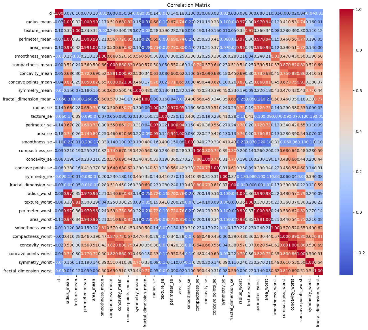
Negative correlations imply a propensity for one variable to fall as another rises, and positive correlations point to variables that tend to increase together. The secret to comprehending the intricate interactions between the features in our dataset is found in this dance of relationships.
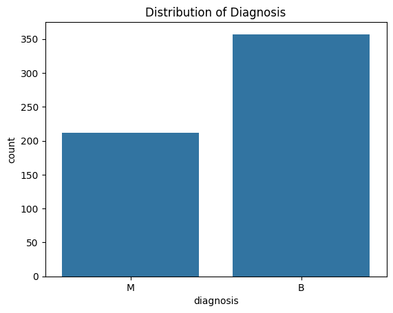
Determining the diagnosis distribution in our dataset is a critical component of our research. The diagnosis of breast tumors and their classification as benign or malignant are included in our dataset.
SVMs in machine learning and the Breast Cancer Wisconsin (Diagnostic) Dataset will be my tools for classifying these tumors. A potent supervised machine learning approach for regression and classification problems is called Support Vector Machines (SVM). Finding the hyperplane that best divides the data into distinct classes is the goal of support vector machines (SVM) in classification. Support vectors are the data points that are closest to the hyperplane, and this hyperplane was selected to optimize the margin between the classes.
Before we get started, let’s refresh your understanding of SVMs. It’s a potent supervised machine learning approach for regression and classification problems is called Support Vector Machines (SVM). Finding the hyperplane that best divides the data into distinct classes is the goal of support vector machines (SVM) in classification. Support vectors are the data points that are closest to the hyperplane, and this hyperplane was selected to optimize the margin between the classes.
I’ll use pairplot to find patterns and connections between feature pairs. A layman may find this intimidating, but it’s not that difficult. To compare the relationship between specific features for distinct classes, the histograms along the pair plot’s main diagonal are not required. The scatter plots in the off-diagonal positions are more helpful when you are interested in relationships between pairs of data, as they display the distribution of each individual feature. Because of the vast number of pairings, I’ll present a section to provide a glimpse of the pairplot:

A single data point from the dataset is represented by each point in the scatter plot. For example, the “radius_mean” value for a given data point is equal to the x-coordinate of that point. For the same data point, the y-coordinate and “texture_mean” value match. The “diagnosis” variable determines the point’s color: benign tumors (“B”) are represented by blue points, whereas malignant tumors (“M”) are represented by orange points.
Why are we doing this? When examining scatter plots for classification tasks, you may want to search for trends or patterns that point to a potential class boundary. A visual line that visibly divides most blue spots from orange points, for instance, suggests that these two characteristics may be useful in the tumor classification process. But when there are more pairs in a pair plot, it gets harder to visually identify linear separability. Nevertheless, you might use a few strategies to concentrate on feature pairings that could be instructive. So we can once again use the correlation matrix, as I believe features with a higher correlation with the target variable (diagnosis) might be more relevant for linear separability.
For a variety of reasons, it may not be feasible or effective to go over every pair in a pair plot for feature analysis. Finding significant patterns or trends is difficult due to the sheer number of plots, and it could result in information overload. Pair plots are useful for showing the correlations between two variables, but they might not be able to depict more intricate interactions between several characteristics at once. Concentrating only on pairwise relationships may cause certain significant patterns or dependencies to be missed. However, it provides you with a general notion of the features that could matter and be decisive.
Instead of doing a correlation analysis, I performed an ANOVA (study of Variance). When working with categorical target variables (in this case, “diagnosis,” with categories “Malignant” and “Benign”), ANOVA is a wonderful concept. ANOVA evaluates if there are statistically significant differences in the means of continuous features within and between target variable categories. It assists in locating characteristics whose typical values could vary depending on the diagnosis group. However, when the target variable is categorical, correlation cannot be directly used. Instead, correlation evaluates the magnitude and direction of a linear relationship between two continuous variables.
Feature Selection: I was able to choose features by using the p-value that I got from the ANOVA testing.
Why Select Only Some Features? Features that exhibit a low p-value (< 0.05) in relation to the target variable are deemed statistically significant. This phase is done in order to highlight characteristics that exhibit notable variations in means between various diagnosis groups. Restricting the selection of attributes to those that are pertinent can streamline the model and enhance its interpretability.
Dimensionality reduction is what we could have done if there were a lot more features. When working with a big number of features, one method for reducing dimensionality is Principal Component Analysis. In this instance, PCA is not required because the emphasis is on utilizing ANOVA to choose particular features based on each feature’s unique relevance and the characteristics that are chosen are not overly many. Also, too few principle components can cause underfitting, in which the model is unable to adequately represent the complexity of the data. However, if a model has too many components, it may overfit the training set and not be able to generalize well to new, unobserved data. When it’s necessary to minimize the number of features while maintaining the greatest amount of variation, PCA becomes increasingly pertinent.
The relevance of standard error
I tried to create an SVM model using every feature that was provided before use ANOVA to implement feature selection. Just 62% of the initial attempt’s results were accurate. This suggests that adding all characteristics, such as ‘texture_se,”smoothness_se,”symmetry_se,’ ‘fractal_dimension_se,’, may have affected the model’s performance by adding noise or unnecessary data. It’s possible that the “se” features (standard error features) don’t have a significant predictive value for differentiating between benign and malignant cases. These are some possible explanations for why ‘se’ features might not be as educational. Features that are biologically significant to the disease are frequently given priority in cancer research. The emphasis may be on characteristics that directly reflect fundamental biological processes connected to tumor genesis, progression, and treatment response, even though precision and variability are significant in some analyses.
When these’se’ features were eliminated, the accuracy of the SVM model increased dramatically to 95%. In order to improve the model’s discriminatory strength and concentrate on the most pertinent data for breast cancer prediction, certain features were decided to be excluded.
When the features were sorted based on their p-values from the ANOVA tests, the top 5 relevant features were identified as follows:
- concave points_worst
- perimeter_worst
- concave points_mean
- radius_worst
- perimeter_mean
- Concave Points (Worst and Mean): Concave points refer to the number of concave portions (indentations) in the contour of the breast mass. The presence and distribution of concave points can provide insights into the irregularity and complexity of tumor shapes, potentially indicating malignant characteristics.
- Perimeter (Worst and Mean): Perimeter measures the length of the outer boundary of the tumor. Tumor perimeter reflects the extent of tumor spread and invasion, with larger perimeters potentially associated with more advanced or aggressive tumors.
- Radius (Worst): Radius refers to the average distance from the center to points on the tumor boundary. Larger tumor radii may suggest larger tumor sizes, which can be a relevant factor in determining tumor aggressiveness.
These features were found to be among the top contributors to the model, indicating that the information they contain may be useful in differentiating between cases that are benign and those that are malignant.
Conclusion
The Wisconsin dataset for breast cancer was first presented. It contained a number of parameters pertaining to the characteristics of the tumor in addition to the goal variable “diagnosis,” which indicated whether the tumor was malignant (M) or benign (B).
An early attempt to create an SVM model with every attribute produced an accuracy of only 62%, which was considered low. This finding suggested that feature selection might be necessary to enhance the model’s functionality.We used ANOVA, or analysis of variance, to determine which factors were most important for predicting breast cancer. After selecting features with significant p-values, it was found that the accuracy of the model increased to 95% when some standard error (‘se’) features were eliminated.
It was determined that some features were too important. These variables indicated components of tumor characteristics that were relevant both clinically and physiologically.
Despite being a highly effective dimensionality reduction method, Principal Component Analysis (PCA) was not considered necessary here. The accuracy of the model improved when standard error features, for example “texture_se,” were removed because it was determined that they were not as informative for predicting breast cancer.
References
Dataset: https://www.kaggle.com/datasets/yasserh/breast-cancer-dataset